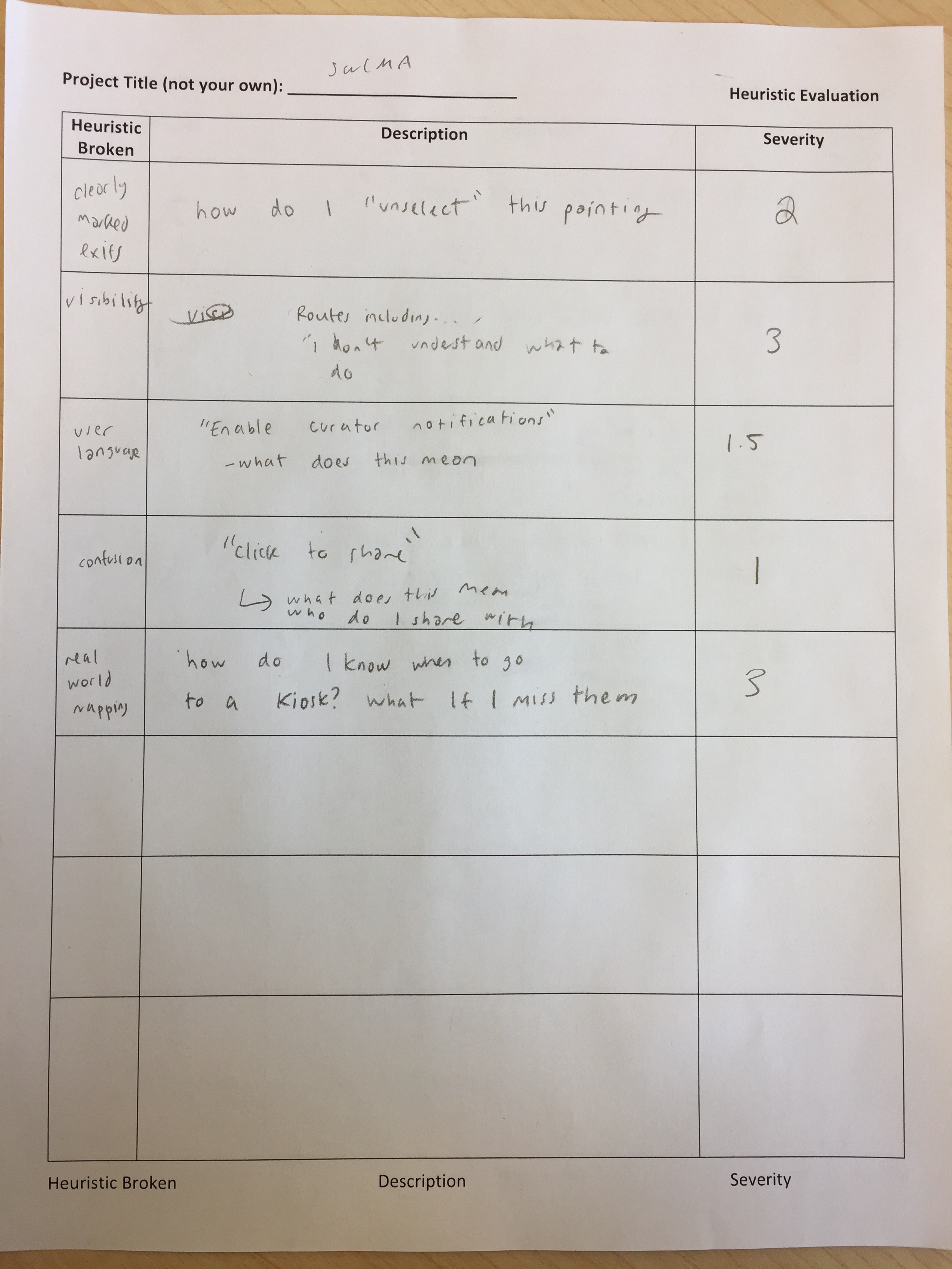
Abby Miller’s Heurisitc Evaluation - facilitated by Casey
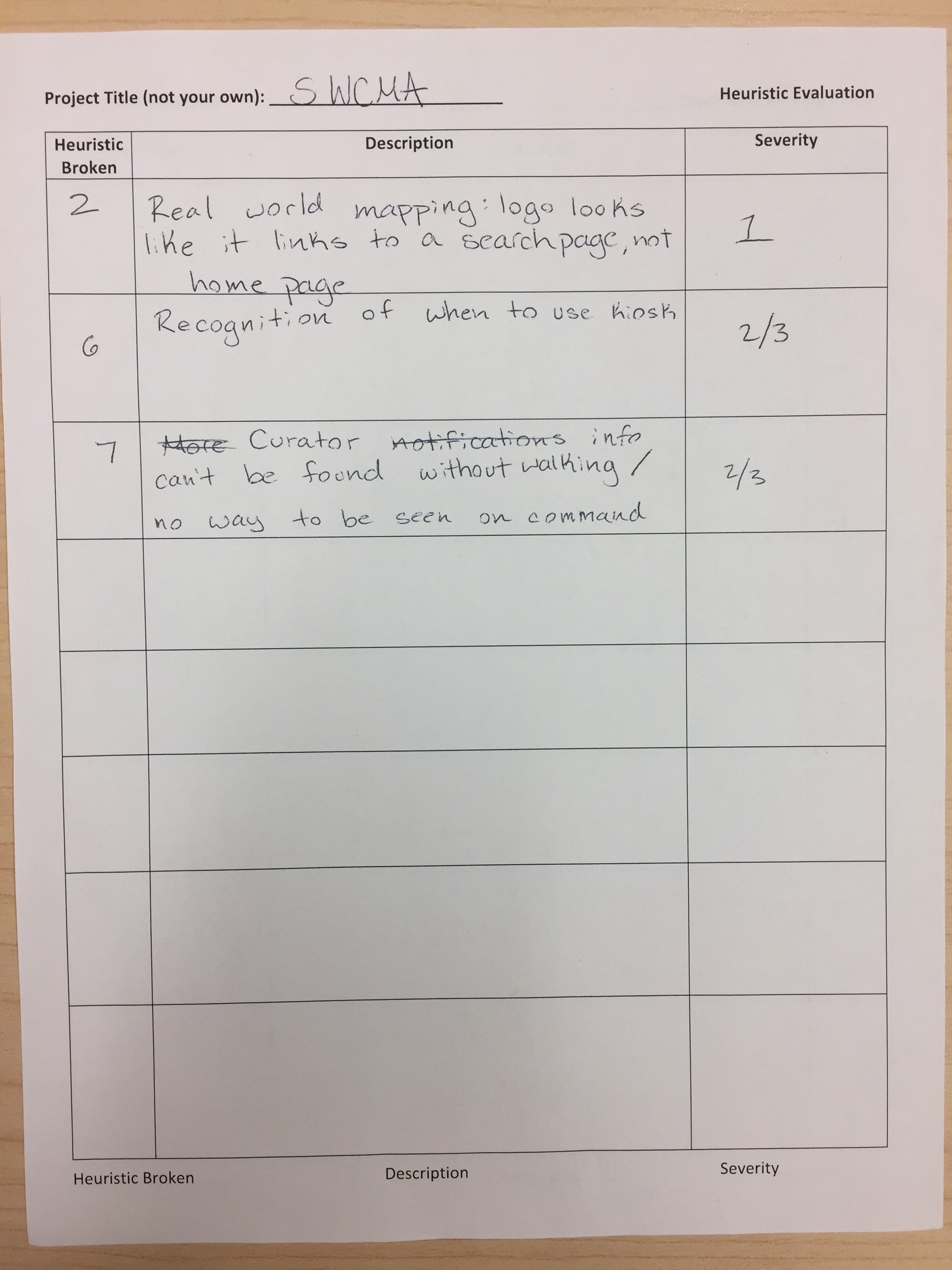
Maria Mejia’s Heurisitc Evaluation - facilitated by Sam
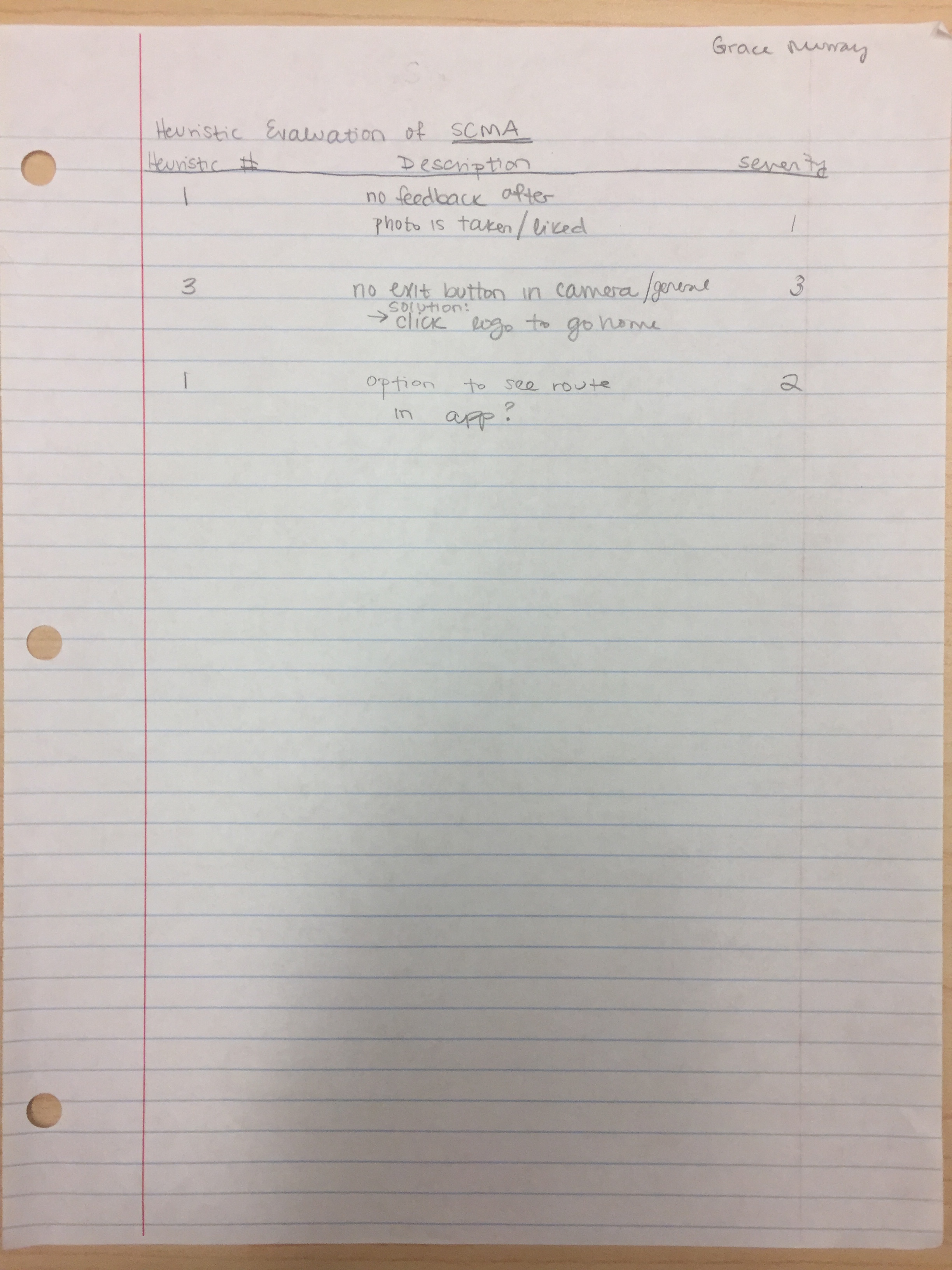
Grace Murray’s Heurisitc Evaluation - facilitated by Sam
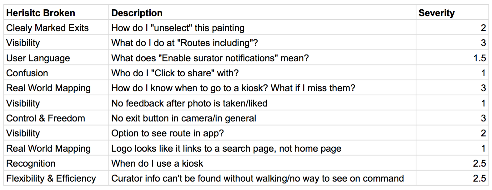
A summary of all the heuristic evaluations:
The following adjustments to the paper prototype for the mobile app reflect the desire for a “way out” from every screen, as reflected by small x’s in the corners of pop-up windows, and back arrows in the corner of every screen.
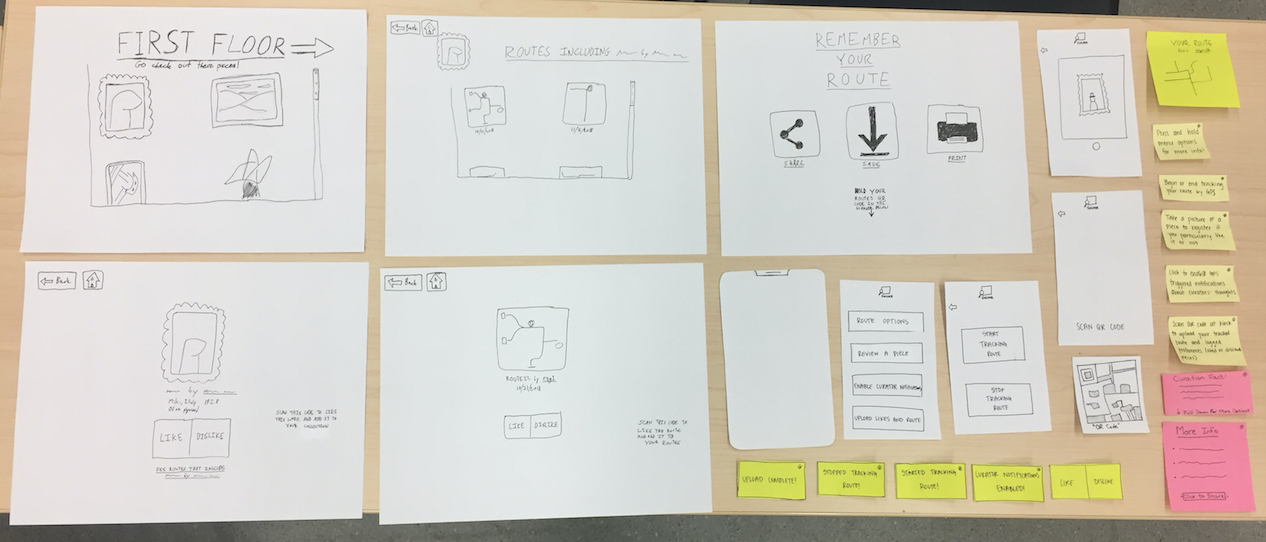
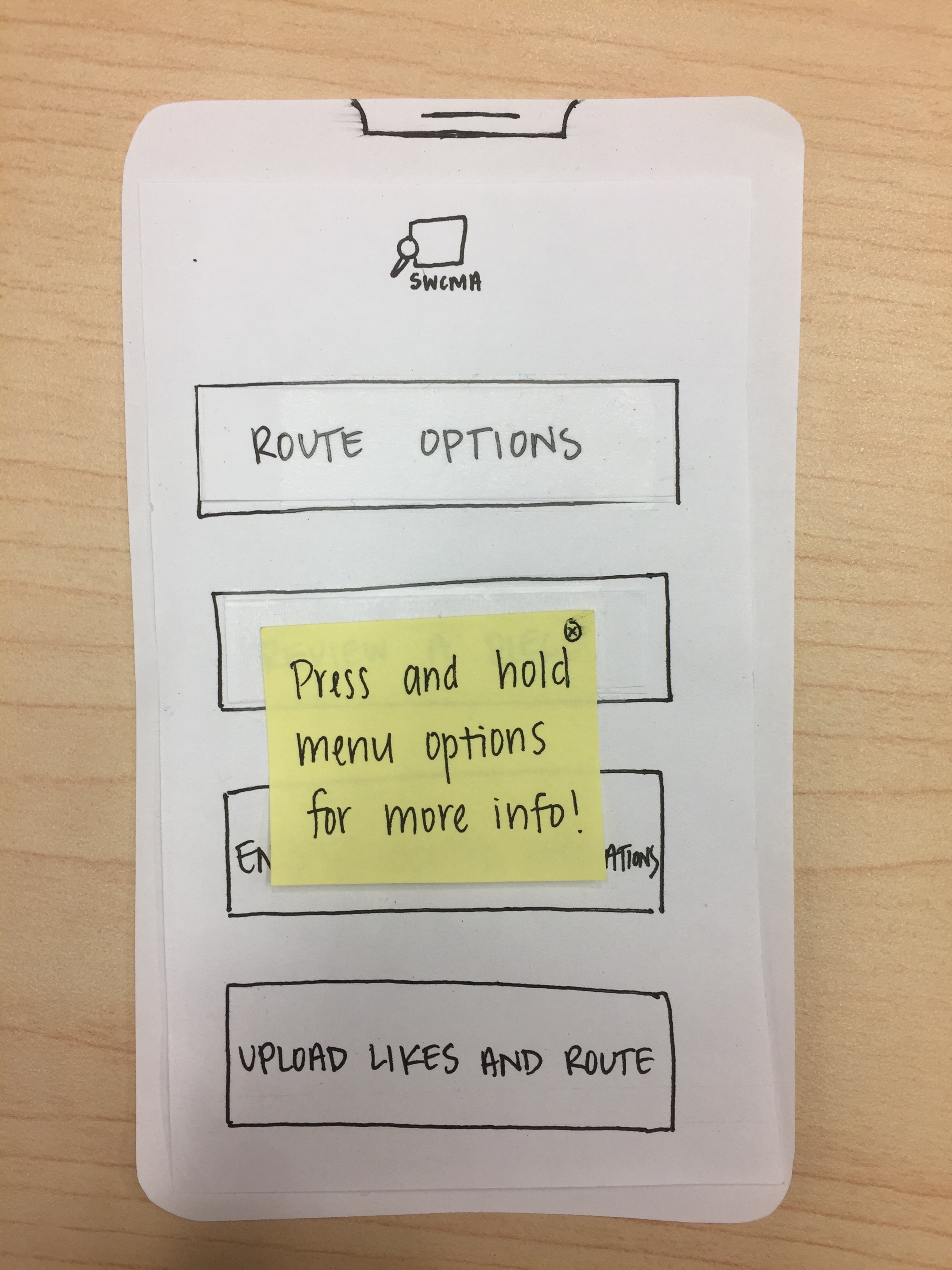
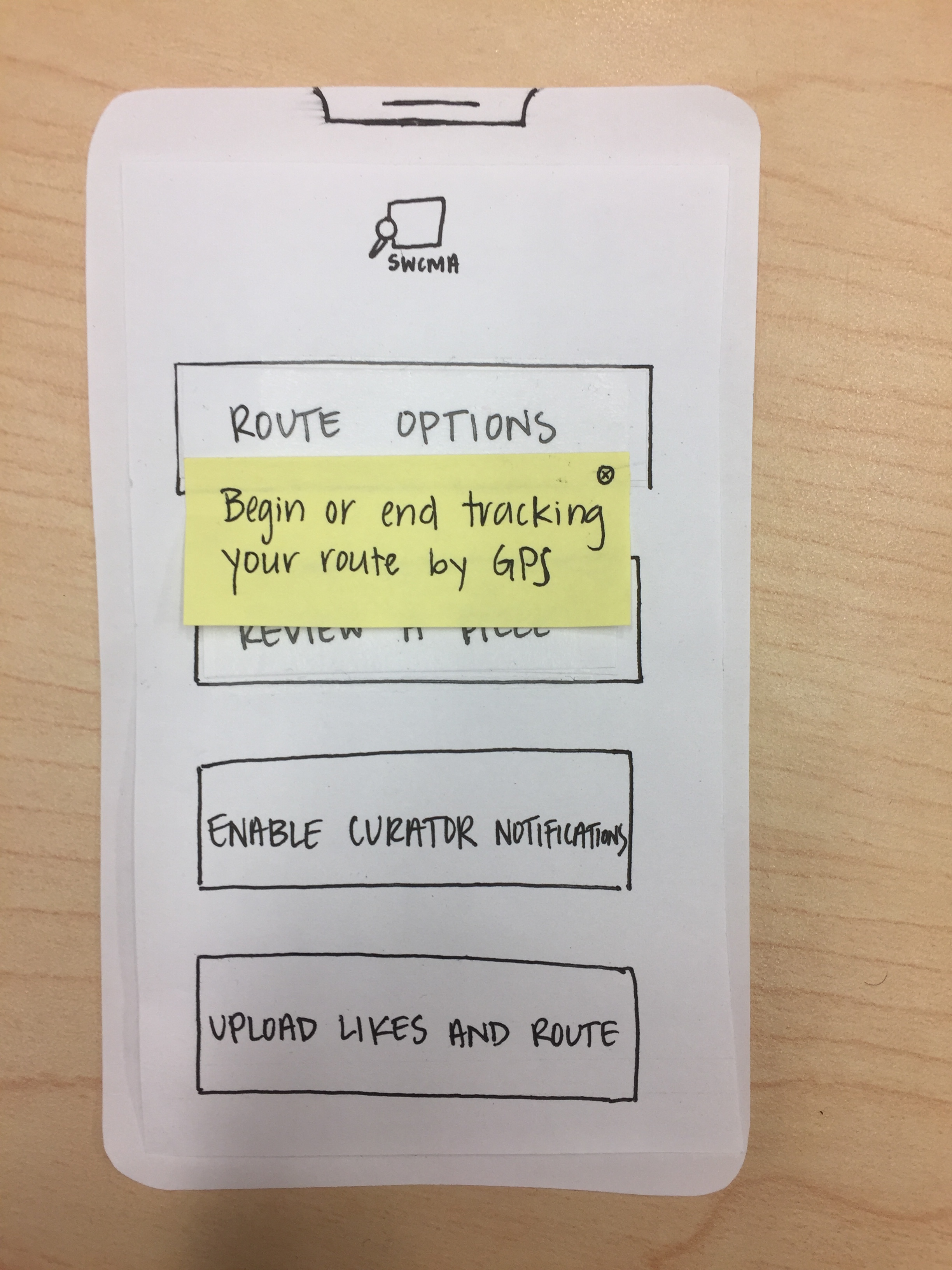
Additionally, the first five photos reflect the users’ desire for guidance from the home menu.
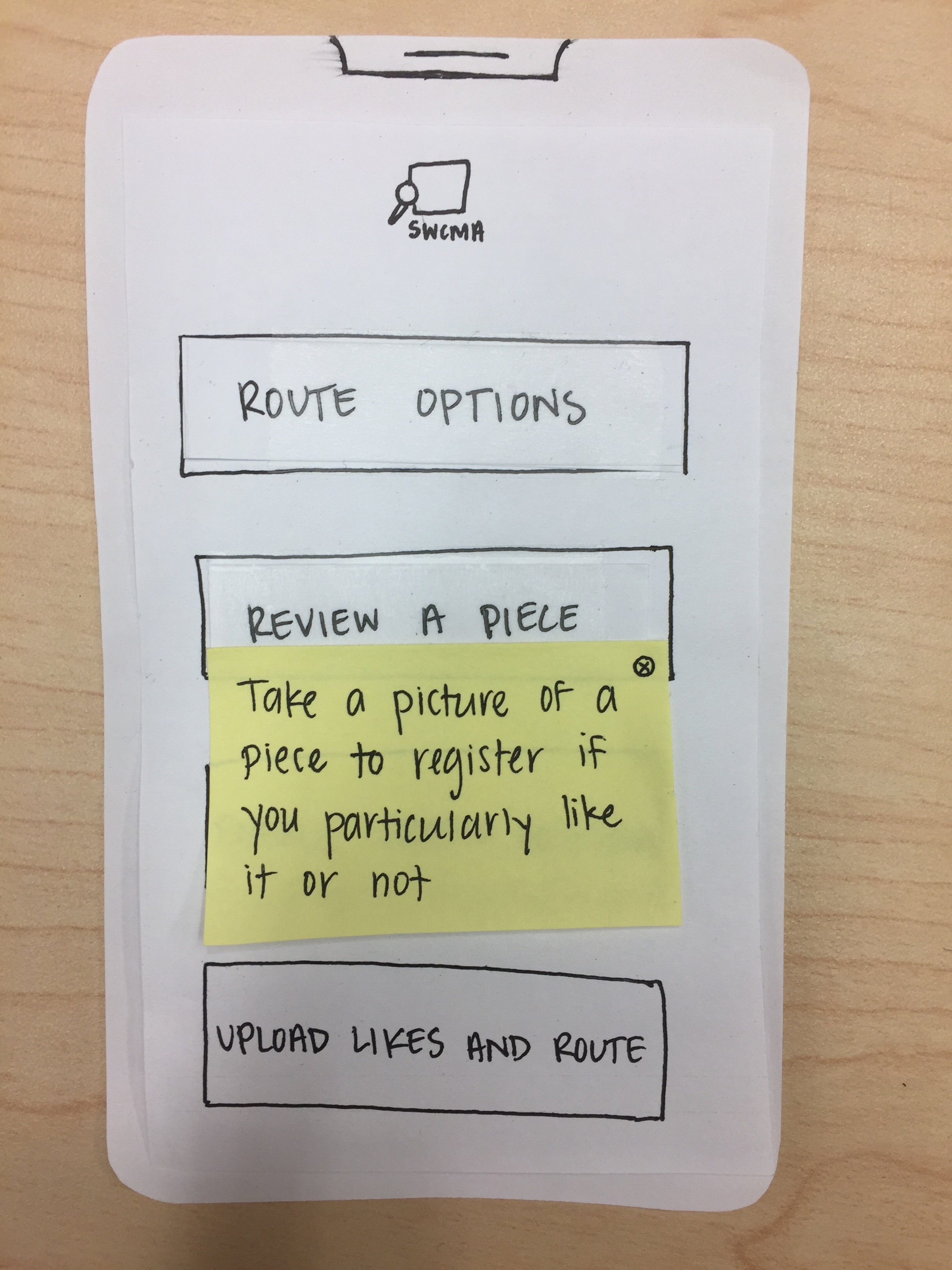
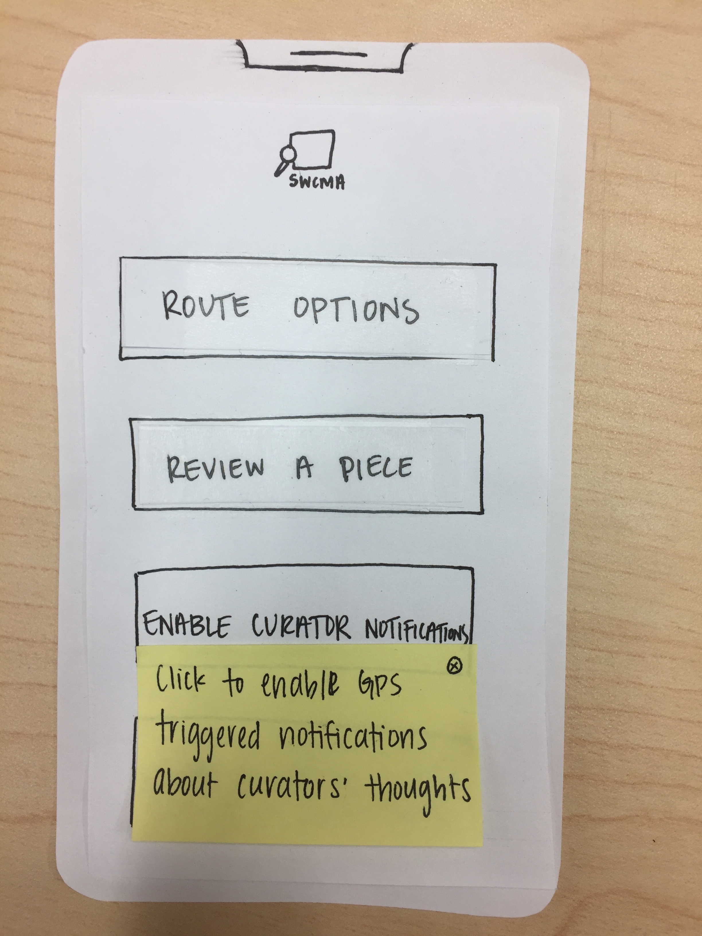
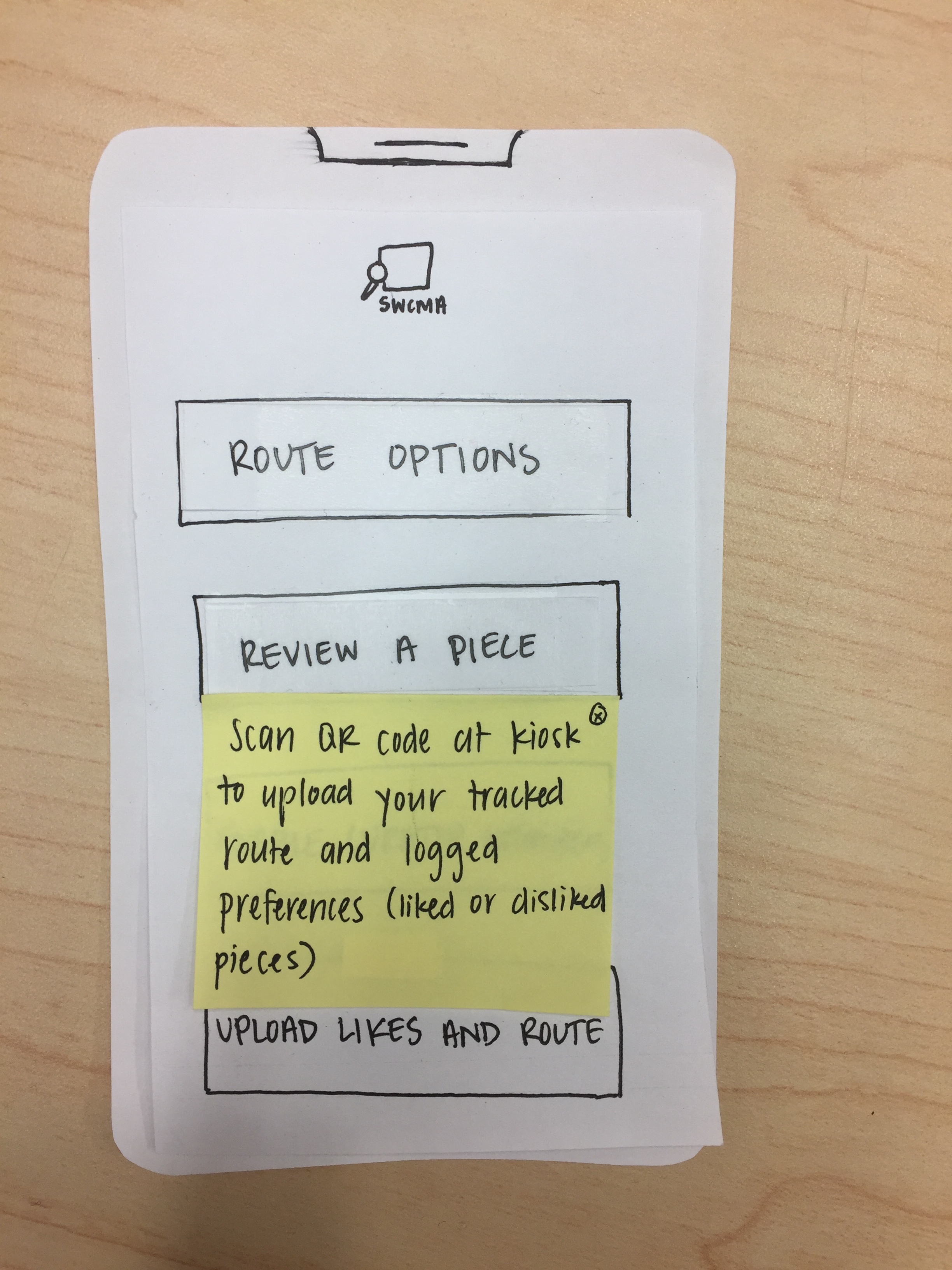
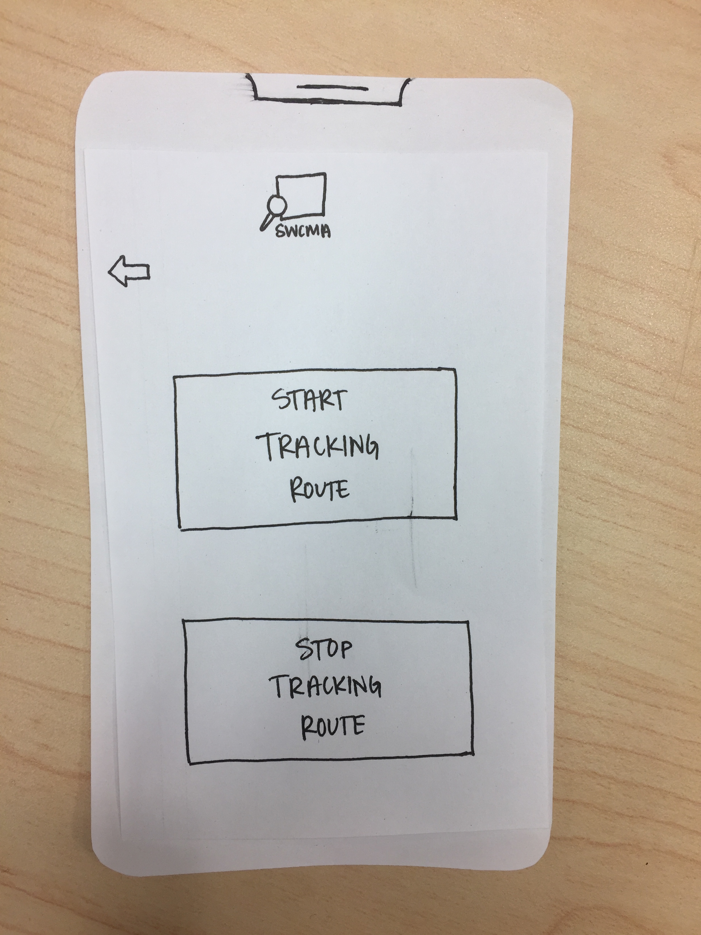
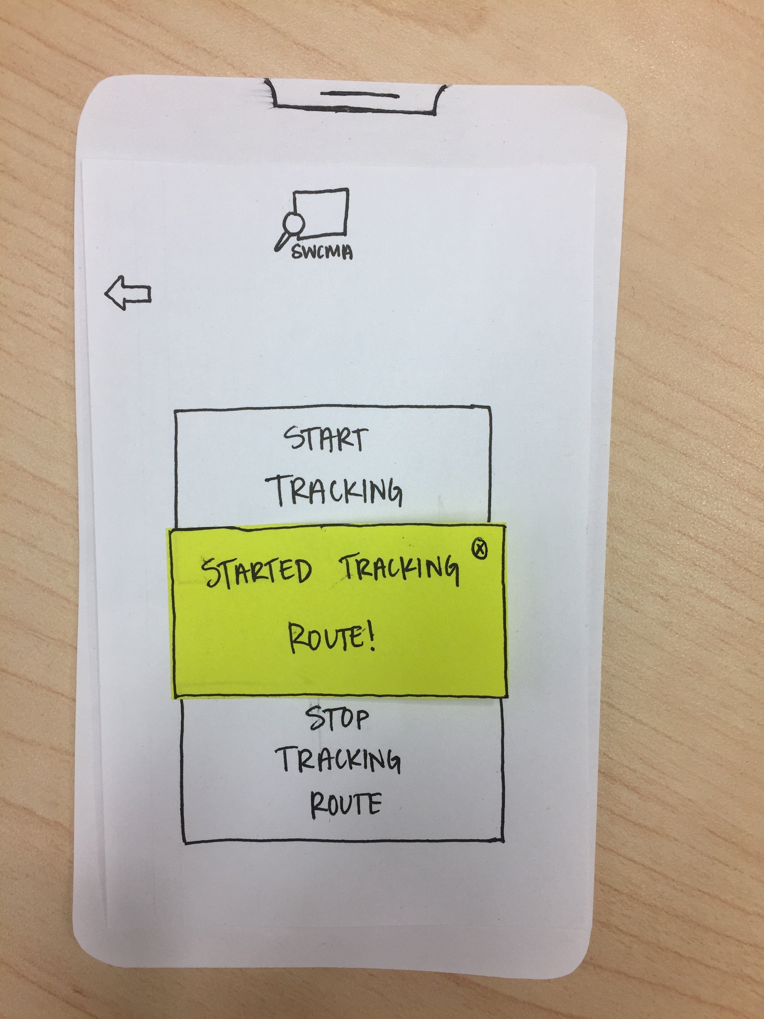
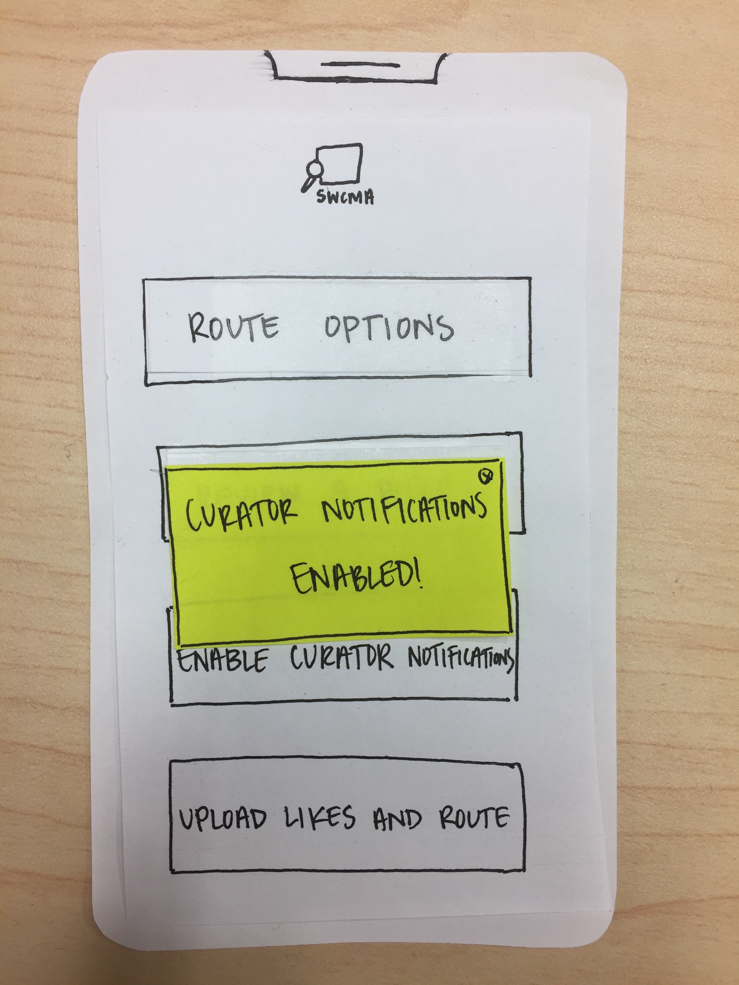
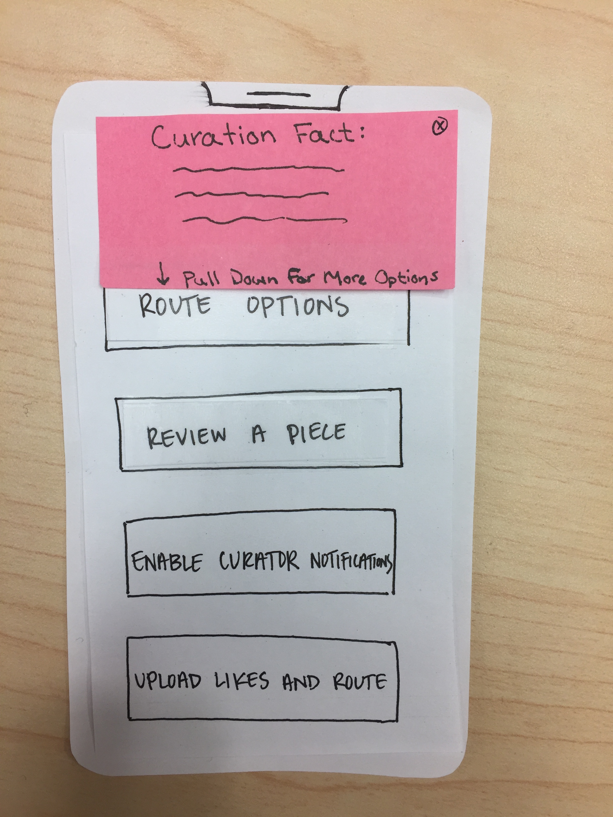
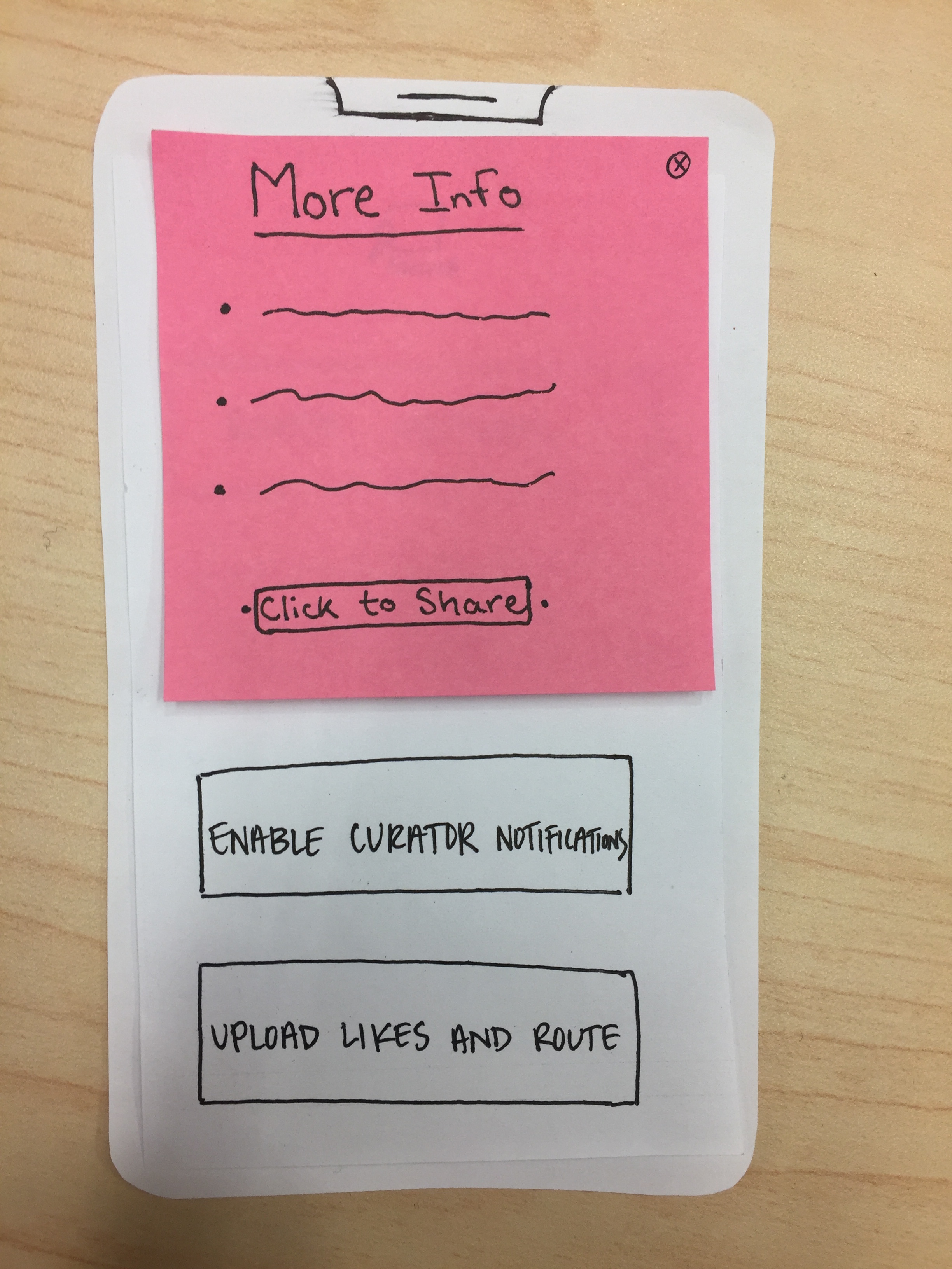
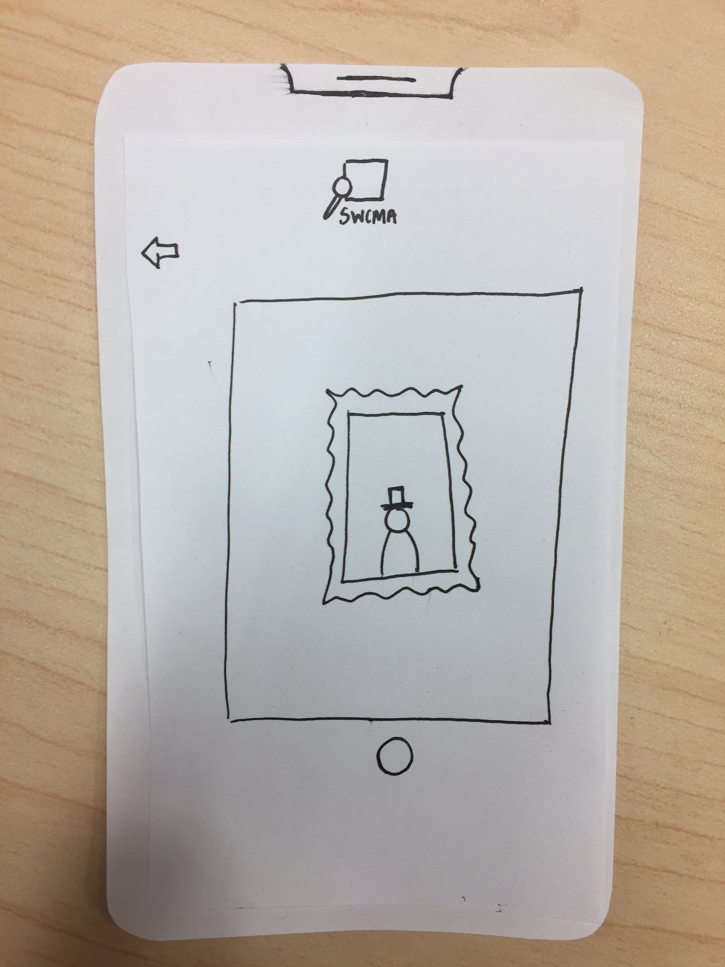
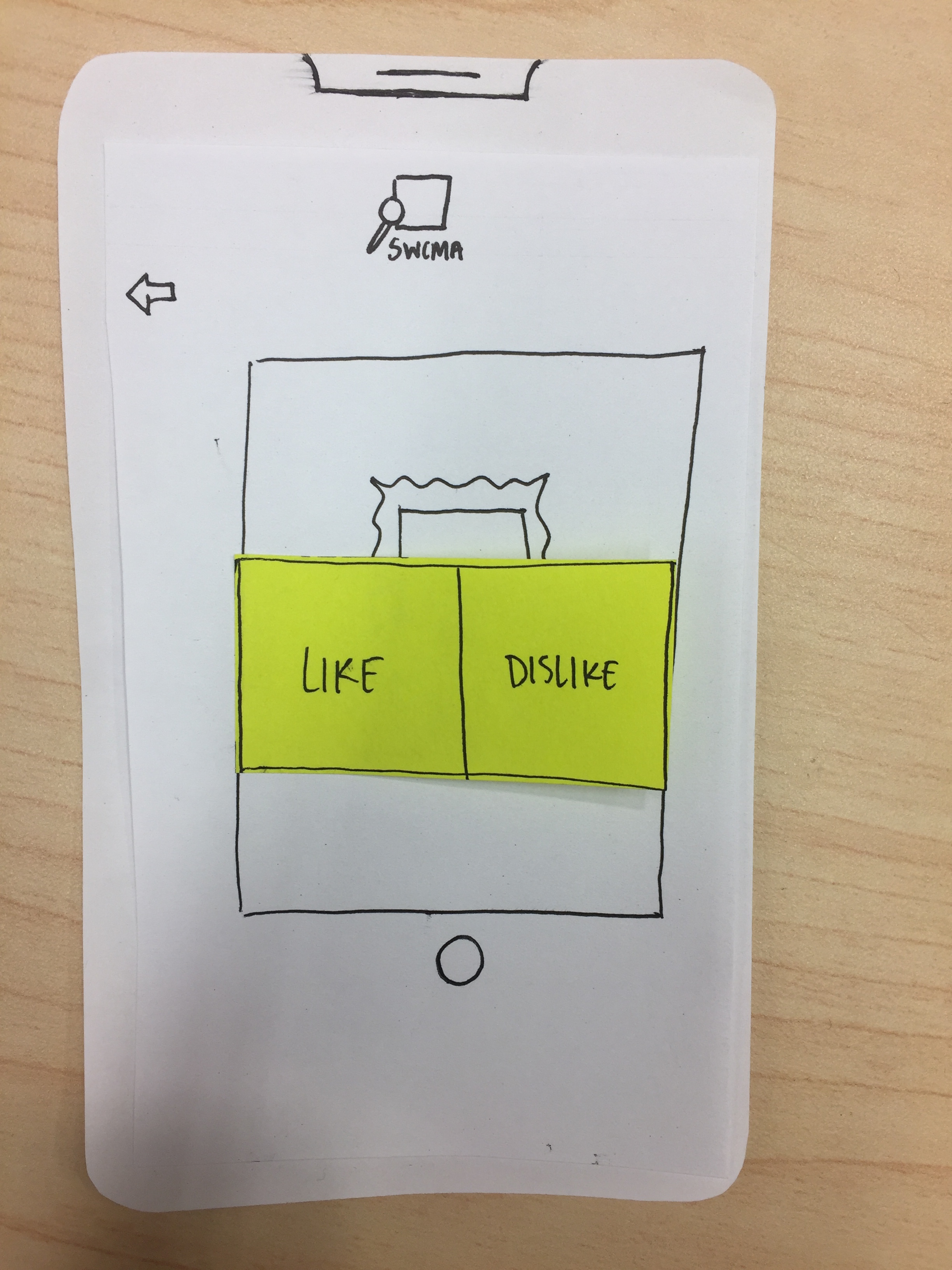
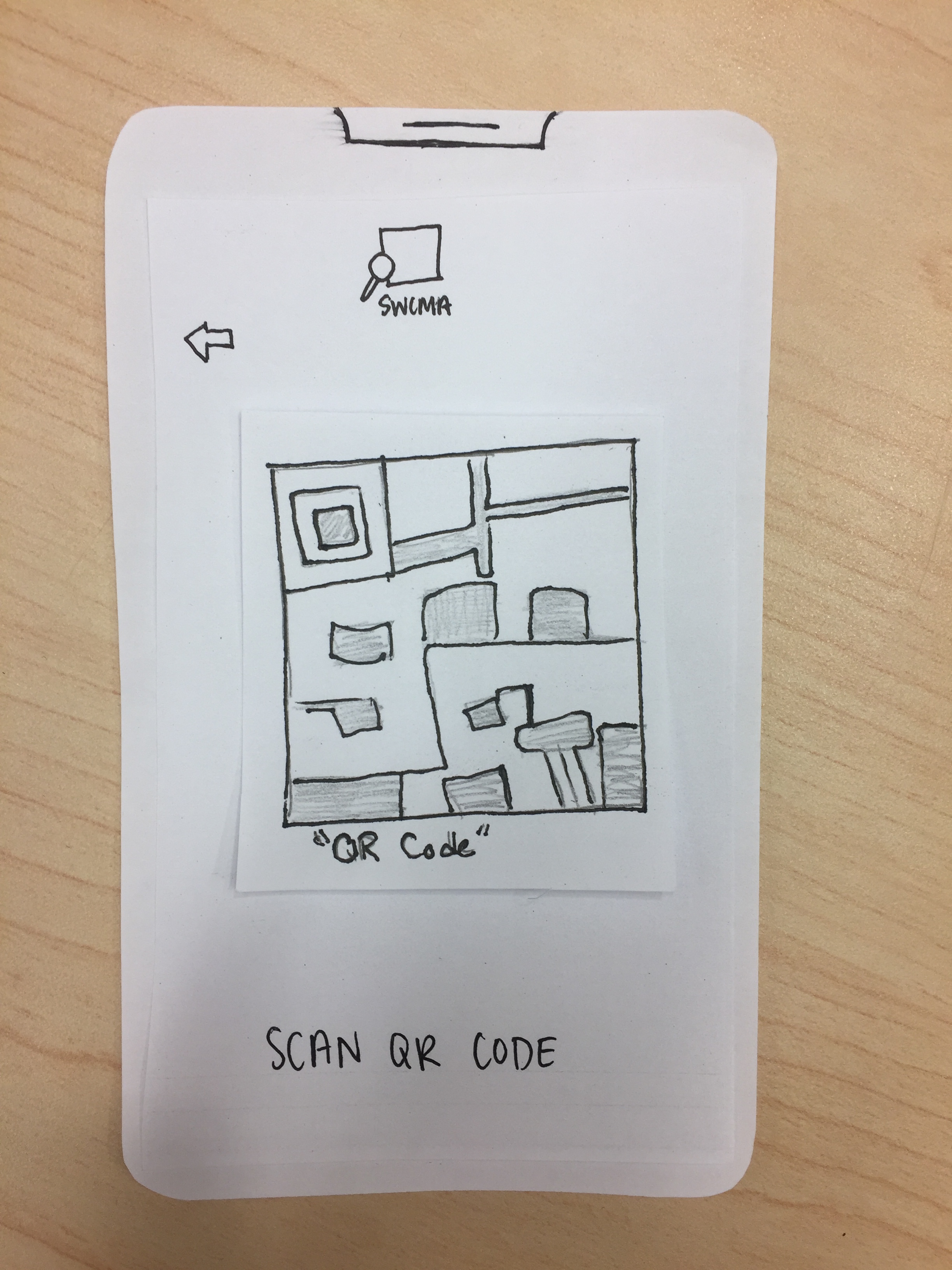
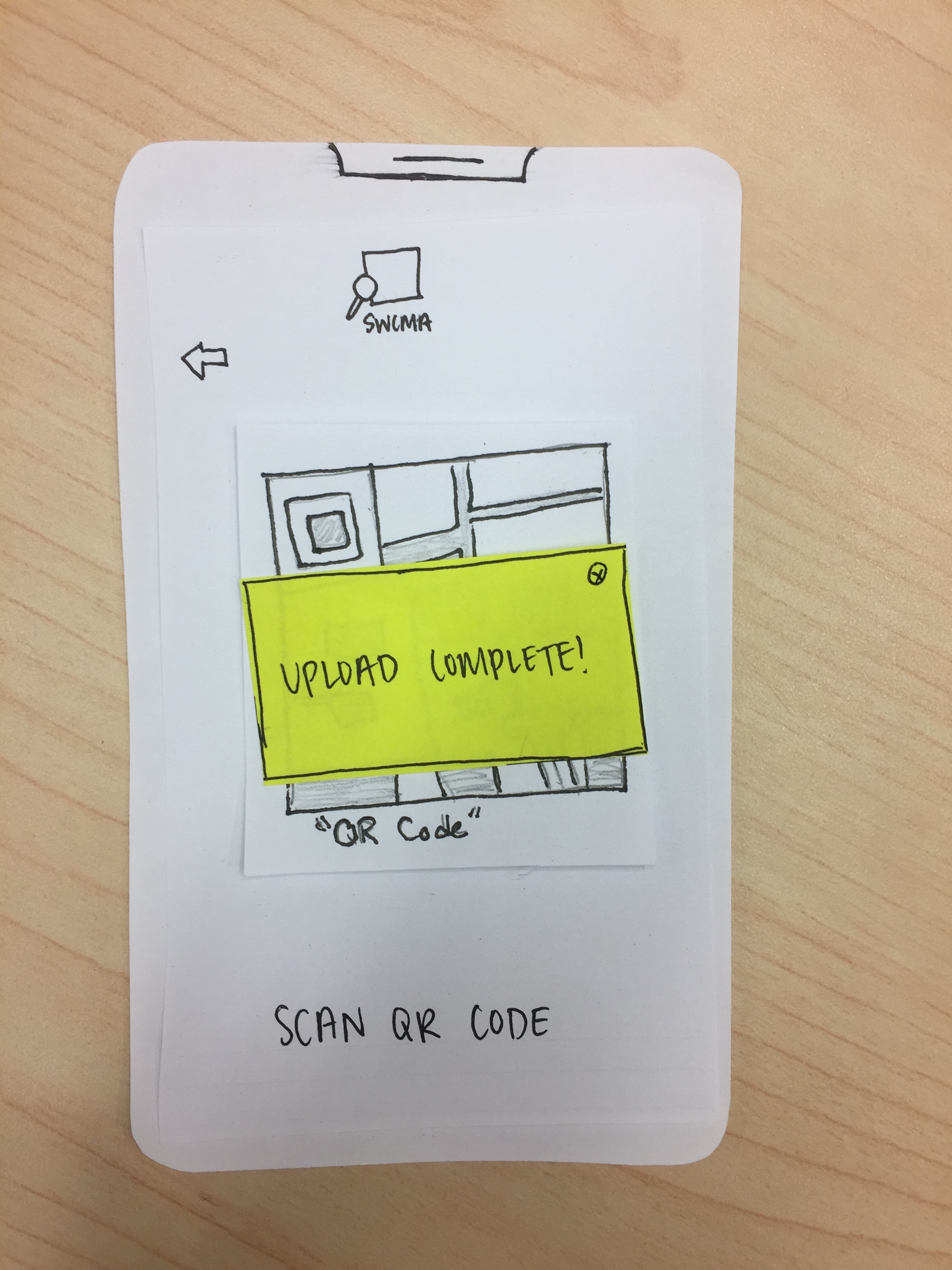
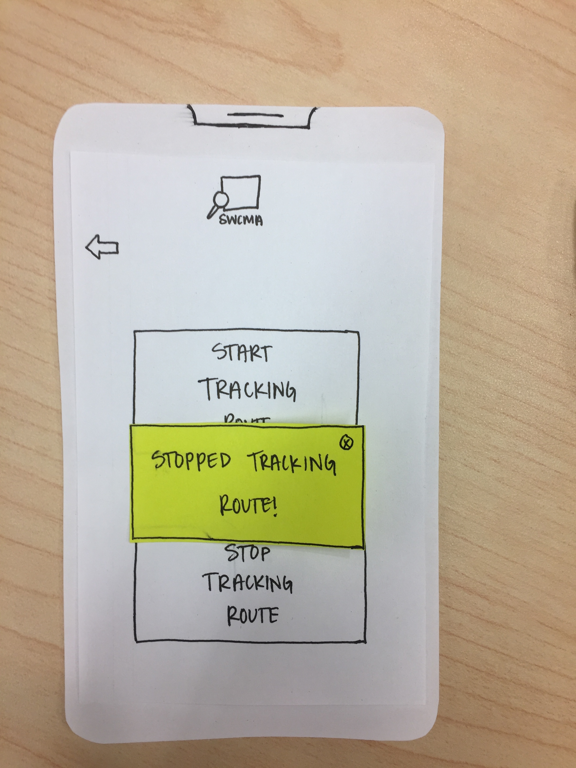
Some of the notes from the evaluations do not feel necessary to address at this point. For instance, we feel the feedback concerning confusion surrounding the logo will be resolved when the actual logo is displayed (this is just a rough sketch). Additionally, feedback would be given after taking a photo through the functionality of the camera in the actual design (similar to how a typial phone camera signals when a photo has been taken).
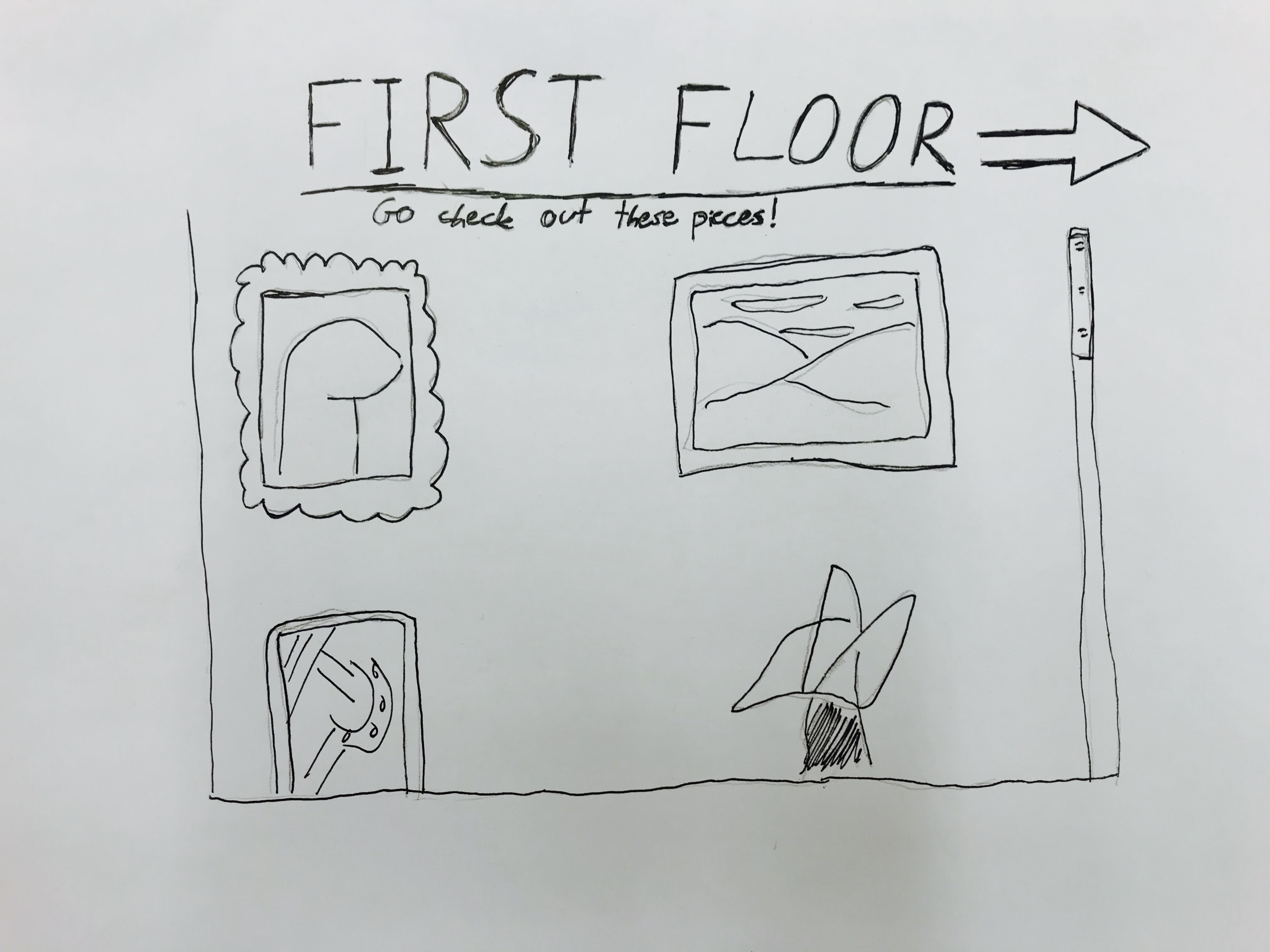
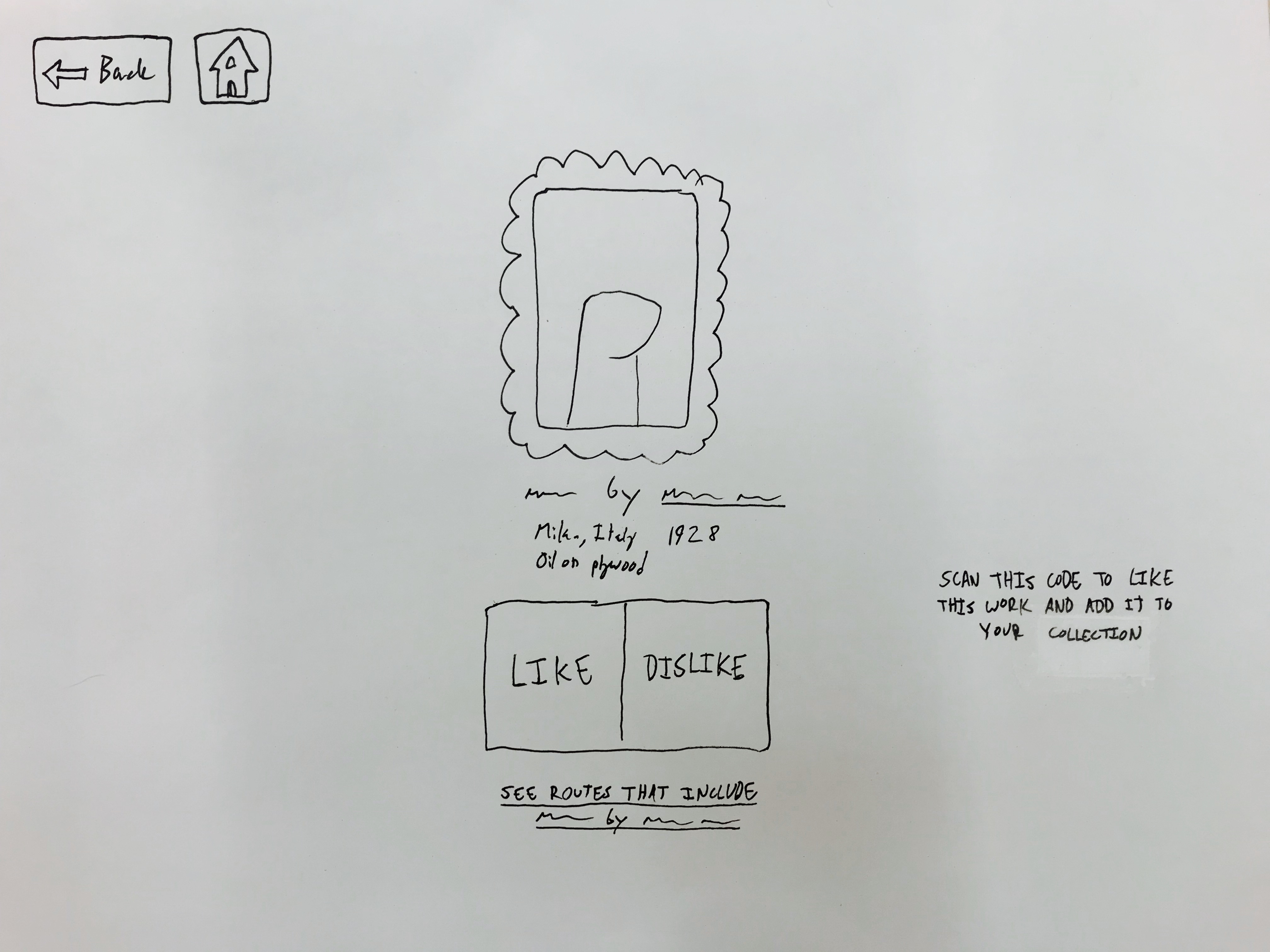
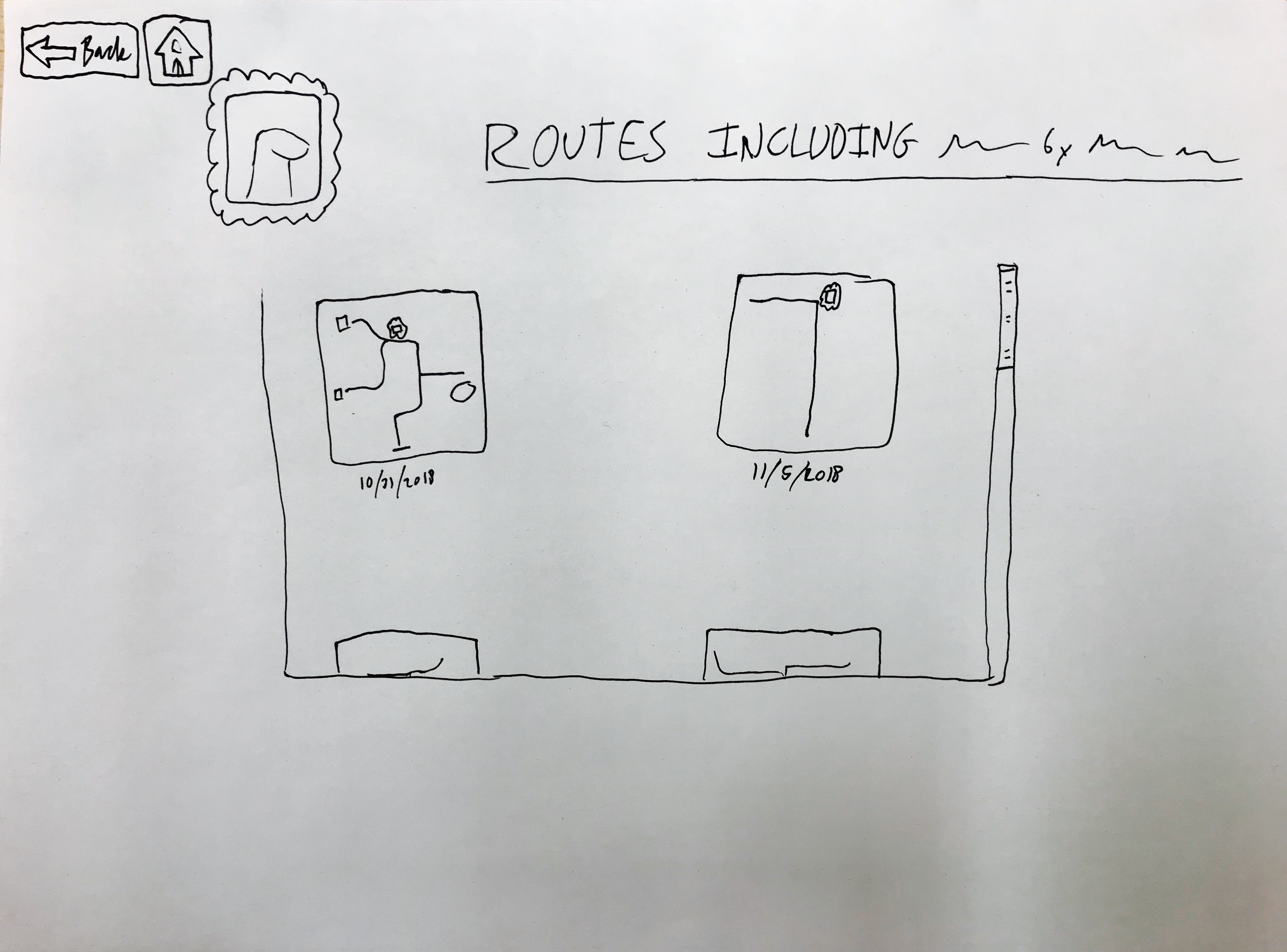
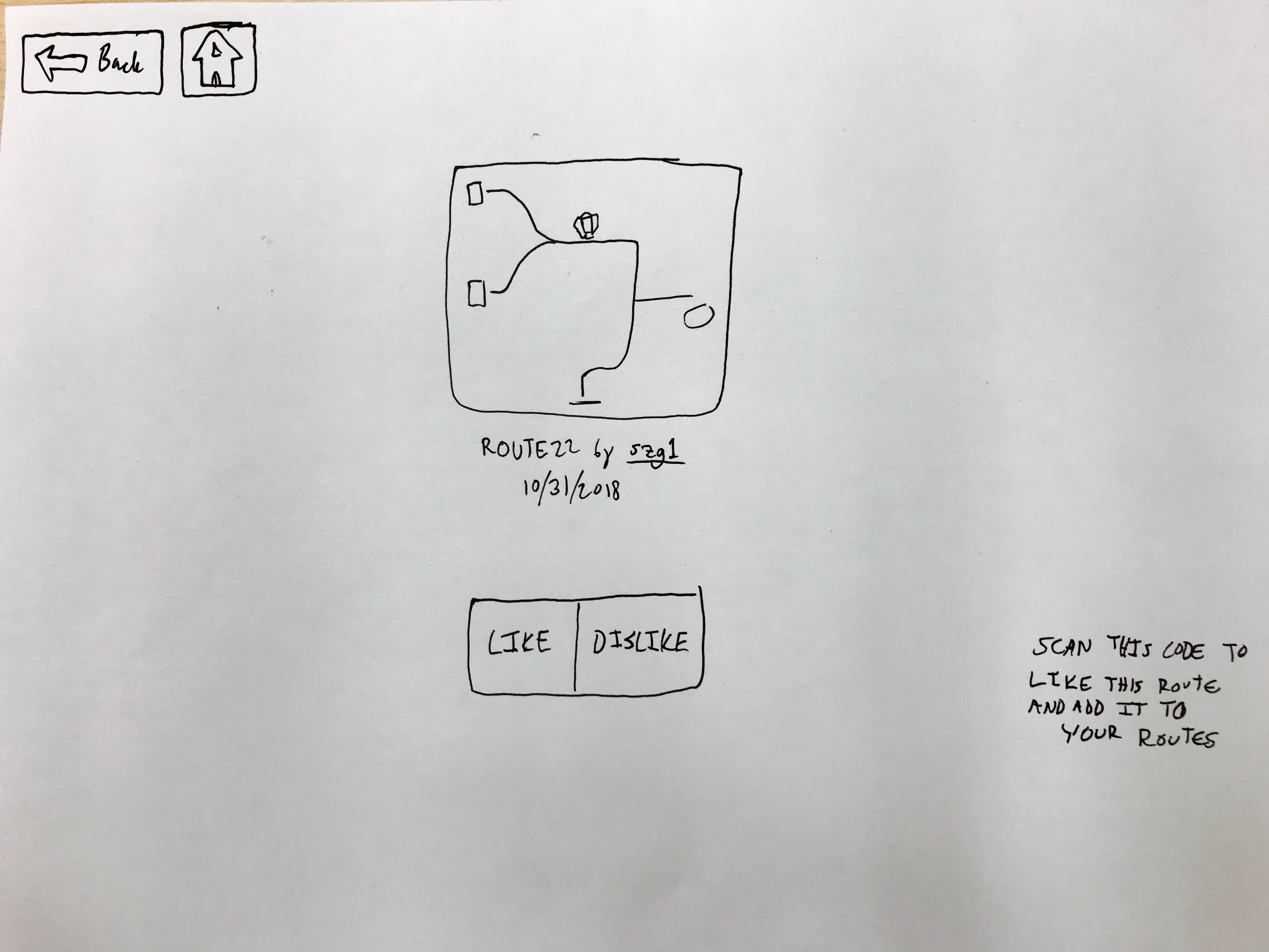
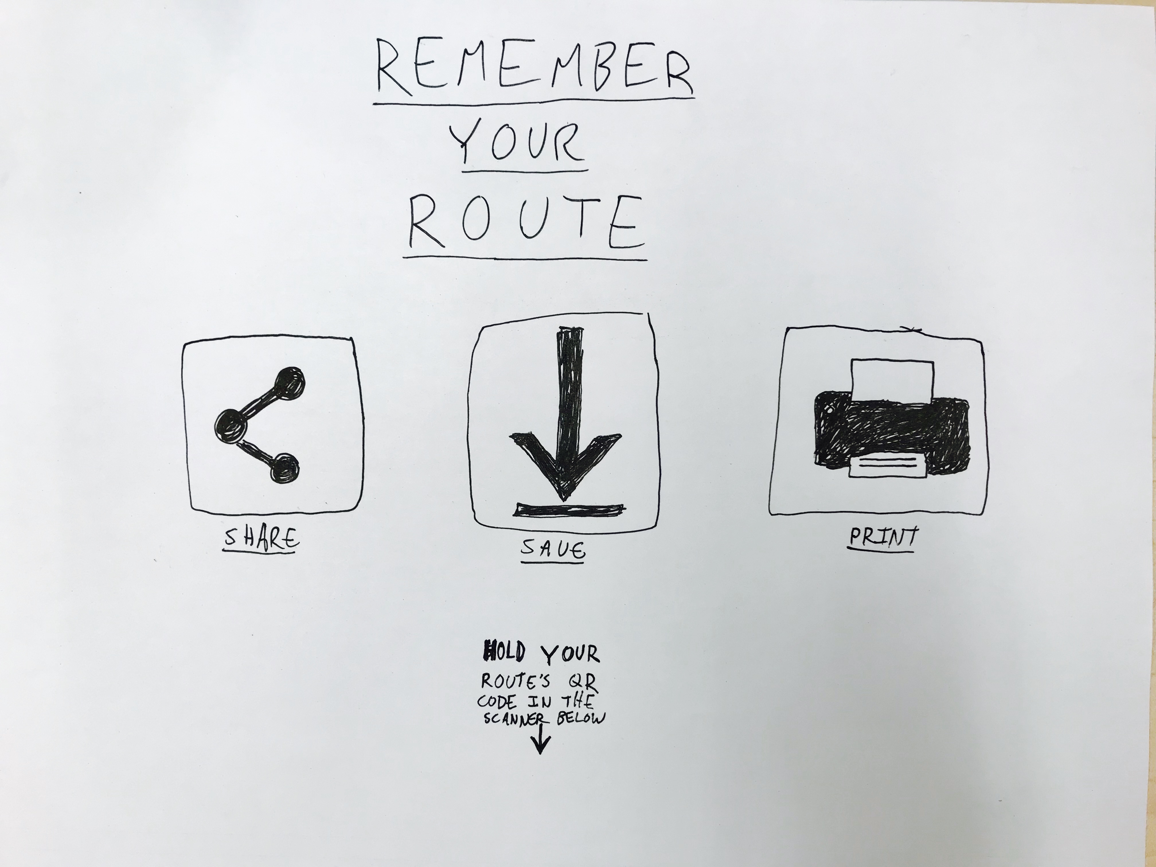
These updated prototypes for the kiosk address the main issue of a lack of back/home buttons in the pages that you get to from the original page on the first floor kiosk. Other than that, they operate the same as in the original paper prototype page. To address the issue of the user being unsure of when to use the kiosk, I will be sure to indicate where the kiosks are located in the museum before asking the subject to use them. The kiosks themselves do not indicate when they are to be used but rather are situated in places where they can be used to find information about the objects that are near them or by the exit as a final activity before leaving the museum.